


Hero Images
A Hero Image is a large, visually prominent banner placed at the top of a page. It
is designed to introduce the page’s primary topic and set the visual tone.
We offer two size options along with multiple style variations to accommodate different content needs and layout
types.
Use a Hero Image when:
-
You want to clearly introduce a major section or landing page
-
The page benefits from strong visual impact
-
You need a headline and optional supporting text over an image
Hero Images should be used thoughtfully and sparingly. Not every page requires one.
Hero Image Cropping Guidance
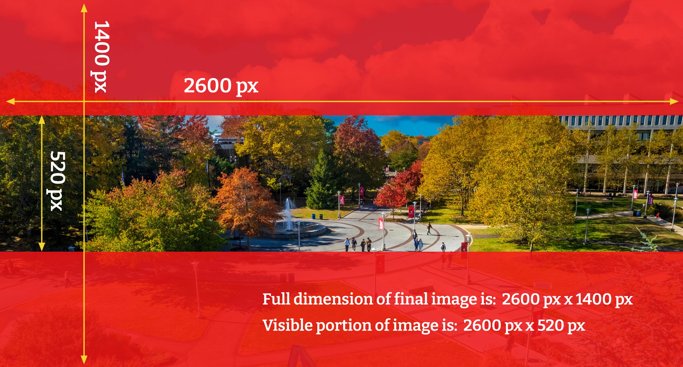
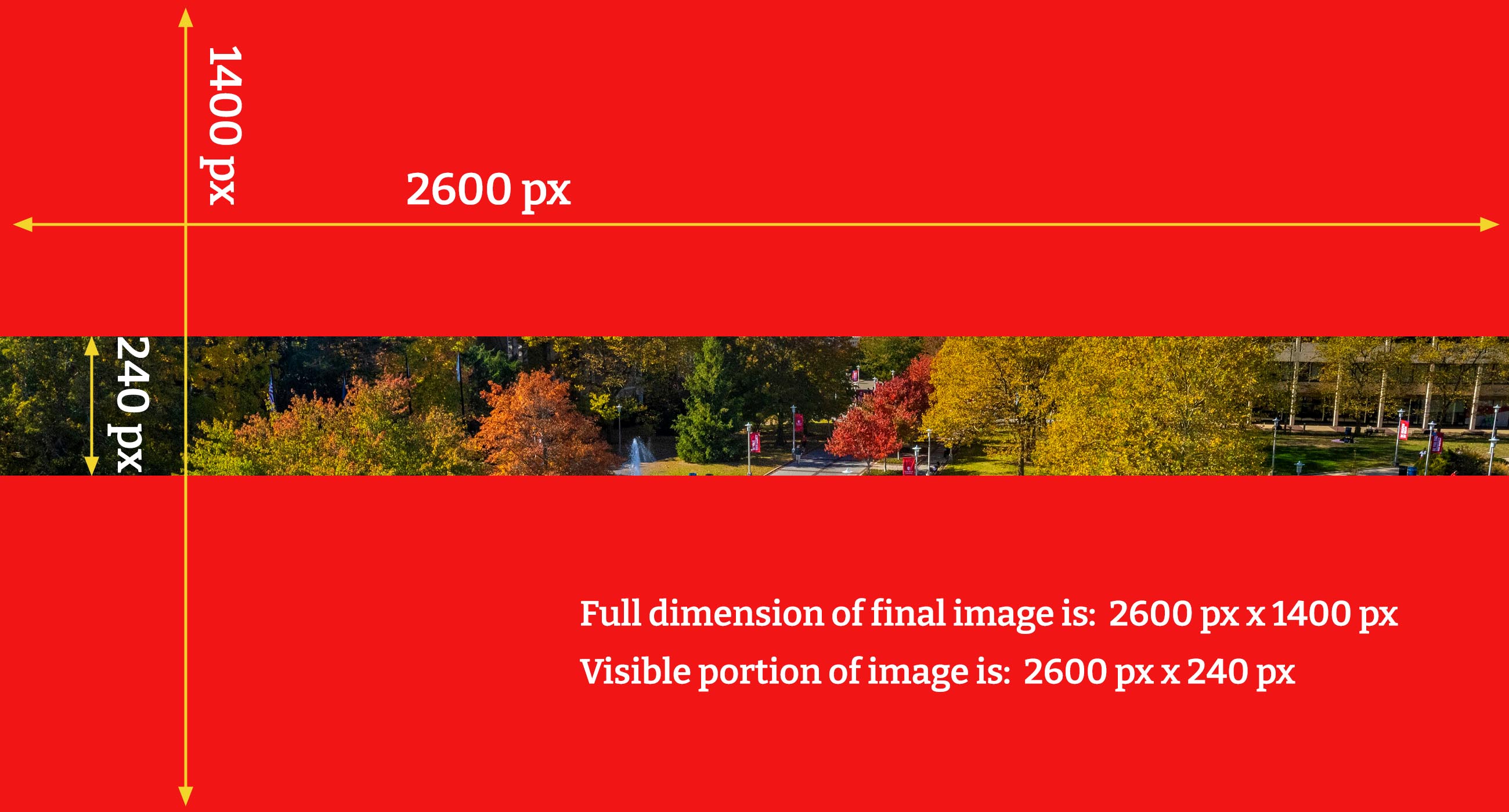
A new hero image guide and templates will be added to the Web Support site to help
editors properly crop hero images. Although hero images are uploaded at 2600×1400
pixels, only a portion of the image is visible on screen, making proper composition
especially important when people appear in the photo.
Large Hero Banners
Small Hero Banners
Hero Variants
For layout differences, and style variations, refer to the examples below.
Variant 1 - Short, Image Only

Variant 2 - Short, Blue Content Area Left; Headline, Subhead; Image Right
Department Hero
This is the Department Hero
Variant 3 - Short, Blue Content Area Left; Headline; Image Right

Department Hero
Variant 4 - Short, Image Under Blue Content Area; Headline; Centered

Department Hero
Variant 5 - Short, Blue Content Area Left; Headline, Subhead; Image Left and Right
Department Hero
This is the Department Hero
Variant 5 (reversed) - Short, Blue Content Area Right; Headline, Subhead; Image Left and Right
Department Hero
This is the Department Hero
Variant 6 - Tall; Image Only
Variant 7 - Tall, Blue Content Area Left; Headline, Subhead, Red Button; Image Left and Right
Department Hero
This is the Department Hero
Variant 8 - Tall, Boxed Blue Content Area Left; Headline, Subhead, Red Button; Full Width Image
Department Hero
This is the Department Hero
Variant 8 (reversed) - Tall, Boxed Blue Content Area Right; Headline, Subhead, Red Button; Full Width Image
Department Hero
This is the Department Hero
Variant 9 - Tall, Boxed White Content Area Left; Headline, Subhead, Red Button; Full Width Image
Department Hero
This is the Department Hero
Variant 9 (reversed) - Tall, Boxed White Content Area Right; Headline, Subhead, Red Button; Full Width Image
Department Hero
This is the Department Hero
Variant 10 - Tall, Centered Headline, Subhead, 3 Buttons; Full Width Image w/ Overlay
Department Hero
This is the Department Hero