Section of Buttons
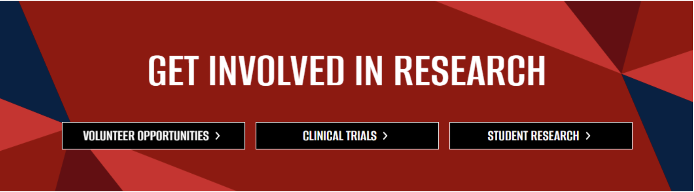
This article walks through how to use the Section of Buttons Box component. This component is ideal for grouping related calls to action, highlighting multiple pathways to key content, and guiding users to next steps in a clear, scannable, and accessible way, such as promoting programs, resources, or audience-specific actions within a single section.
There is a second variation of this component where you can split the box in half. Each half can have a headline and one button.

What This Component Is
The Section of Buttons component groups multiple related calls to action into a single, clear section so editors can guide visitors to the right next step without scattering buttons across the page or repeating content blocks.
When to Use
Use this component when:
- You want to present several related actions together (ex: apply, learn more, volunteer, explore resources) in a clean, scannable format.
- You need to direct different audiences to different paths from one spot on the page without overwhelming them with text.
Avoid this component if:
- You only need one call to action (a single button within standard content is clearer).
- The actions require long explanations or supporting content (use dedicated sections or feature components instead).