GRAPHIC ELEMENTS GUIDELINES
Questions? Please contact Karen Leibowitz, Art Director: Karen.Leibowitz@stonybrook.edu
INTRODUCTION TO PRISMS
Stony Brook University is a prism that illuminates the world, spreading light in all directions. Much like a gemstone, our community is multifaceted. It’s a mosaic radiating with ideals and beaming with dreams.
To this end, use Stony Brook University brand Prisms in communications to create visual texture, depth and interest, and to symbolize who Stony Brook is.
Download Prism Assets for Website Use
PRISM ANATOMY
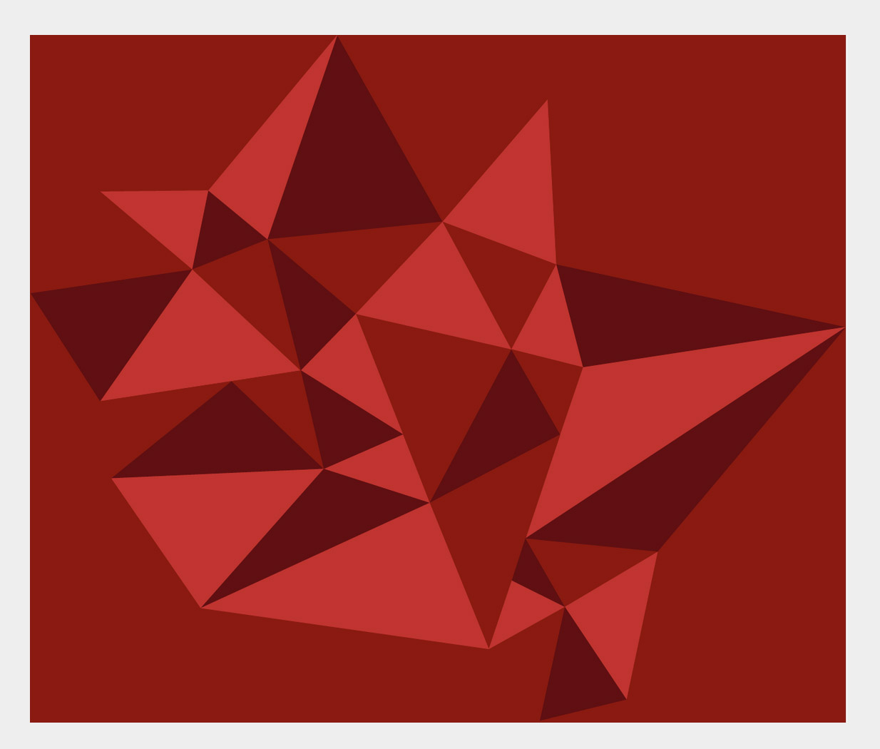
Prisms are made up of triangles and occasionally, of shapes that can be constructed of triangles. The triangles should vary in size within the pattern. They can be aligned point-to-point or perpendicular to another triangle’s side. Keep things simple when using Prisms. The busy pattern of the Prism can become overwhelming unless used with care and consideration.
The primary Stony Brook Prism uses Stony Brook Red as its most dominant color – with Stony Brook Bright Red and Stony Brook Dark Red as accents.
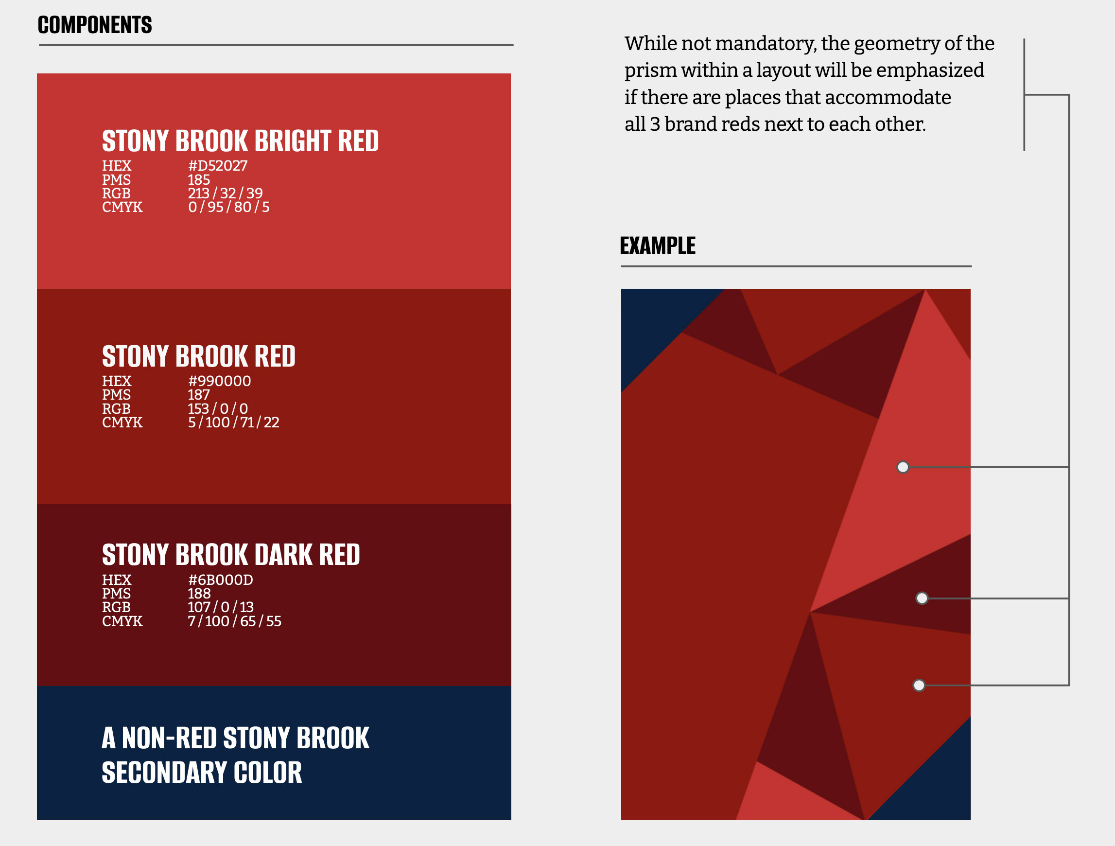
To keep the Prisms appropriately balanced, use Stony Brook Red as a main field of color in the Prism. The structure of alternating red triangles mimics the appearance of a gemstone. Attempt to include at least one (and up to 2) uninterrupted sections of all 3 brand reds next to each other to create geometry, depth, lighting and contrast.
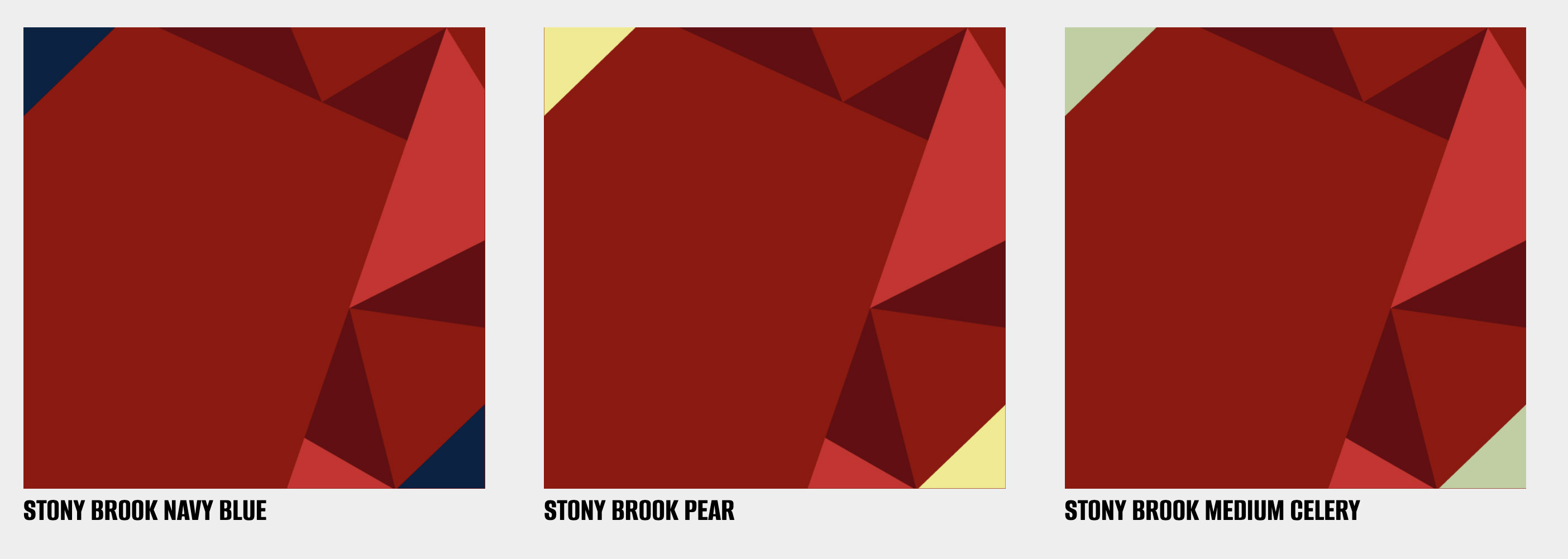
PRISM SECONDARY COLORS
In nearly all executions, secondary Stony Brook colors should be applied to Prisms as a supportive visual accent. Any secondary color is acceptable, except the three Grays, which should not be used in a prism. Only a single, non-red secondary Stony Brook color may be used at one time. Stony Brook reds must always be the most prominent color in any Prism construction. The proportion of reds to non-red secondary colors should be 80:20.
PRISM CONSTRUCTS
When using a Prism background behind text or a logo, use a larger triangle or triangle-constructed shape as your main field of brand color behind the text/logo to ensure legibility. The shape and size of this primary field of Stony Brook Red will vary depending on the layout and/or application. The more information being presented, the simpler the layout should be and the larger the field of Stony Brook Red will need to be. The Prism is used to add visual texture; however, it should never impede the primary communication of the message.
The main field can be filled with brand red or with a photo. Text can also be inserted over the main field.
PRISM FLEXIBILITY
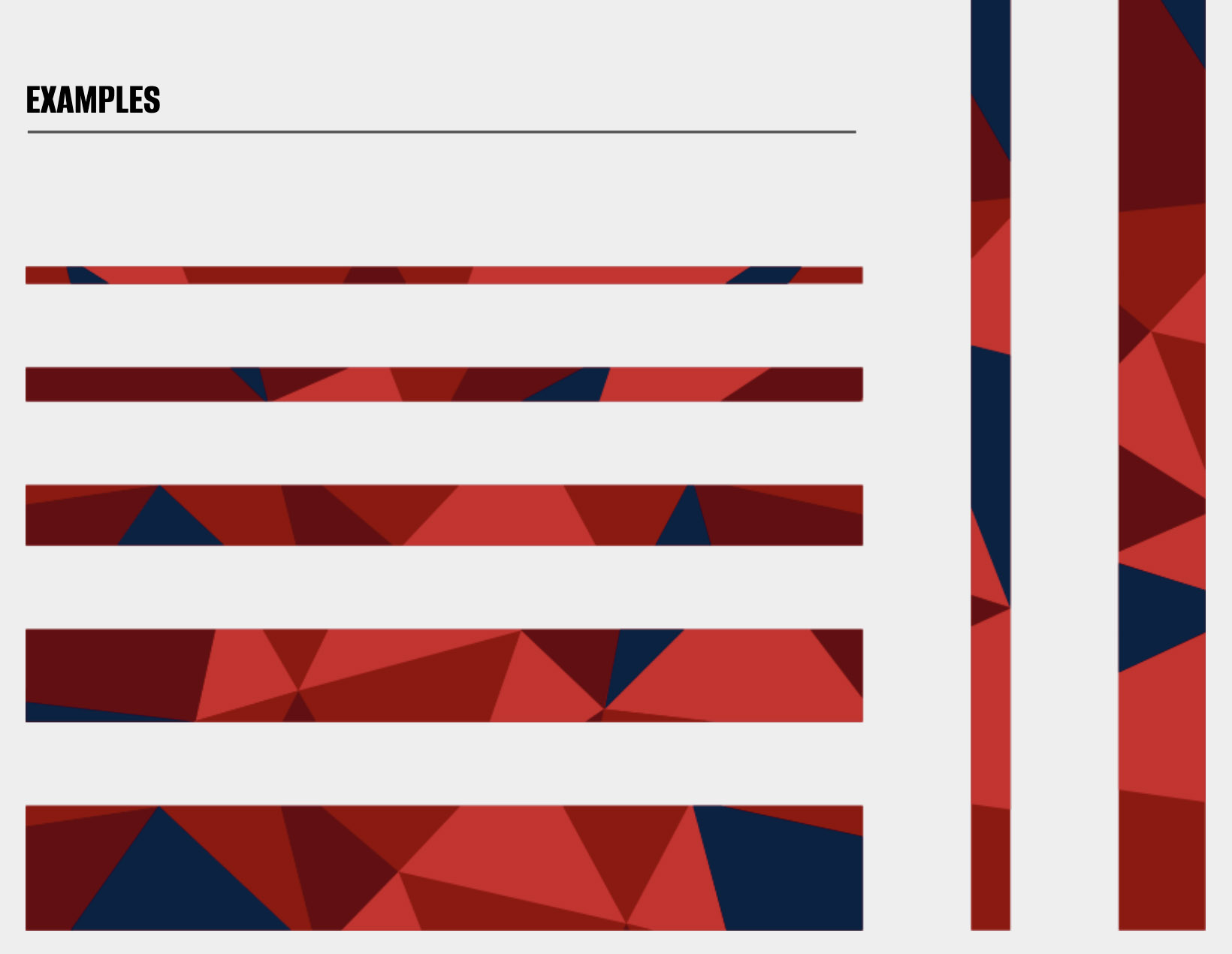
Prisms may be arranged in a variety of constructs and layouts, bringing dynamic visual energy to a design. The full prism pattern shown here can be used as a starting point. You may enlarge, reduce, crop, flip and/or rotate the pattern for variety.
If your design requires thin bars, use a section from the full prism and be sure to add a secondary color.
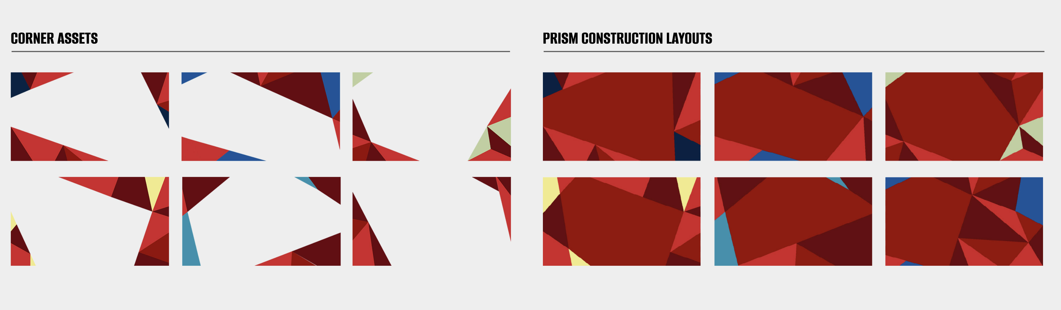
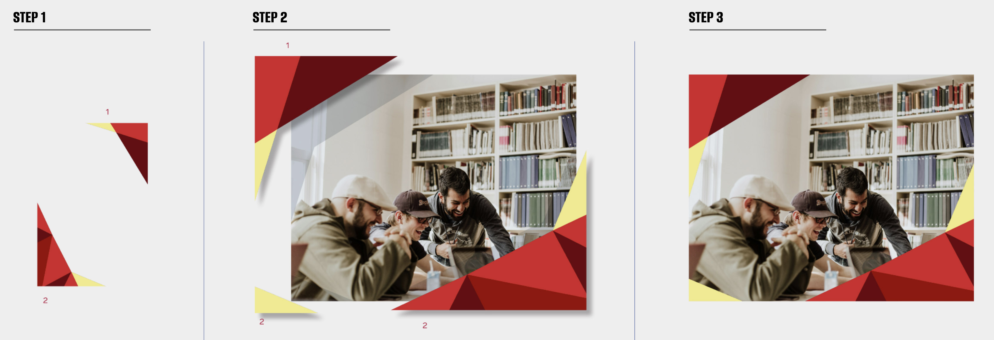
PRISM CORNER ASSET IMPLEMENTATION
The Prism Corners are designed to quickly convert visual communication from the university into appropriate brand campaign deliverables. The corners are designed to be placed in the corners of layouts and scaled, cropped or rotated as needed to create the desired effect.
PRISM DON'TS
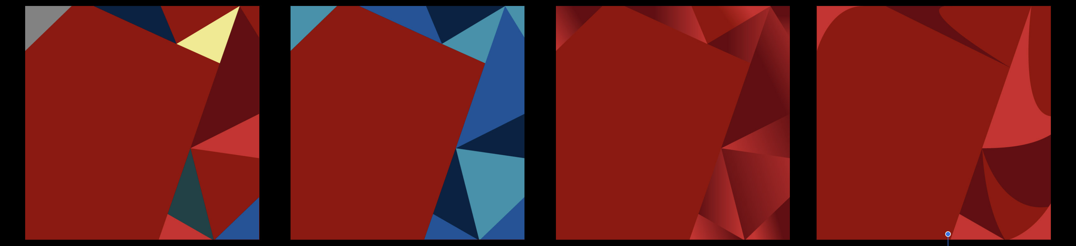
Prism applications that DO NOT align with the SBU Brand Guidelines:
- DON'T use multiple non-red Stony Brook colors in a prism
- DON'T make prisms from colors other than Stony Brook reds
- DON'T use gradients in prisms
- DON'T use curves in the prism construct
